Problem
Keystone State Bombers was ready to evolve into a newer, sleeker version of their team. They wanted their brand and website to stand out from the competition in terms of their look and design and be reflective of current design trends in line with a cutting-edge technology company. They also needed to ensure their numerous resources, testimonials and lineups were easy for them to update and simple to search for their audience.
Solution
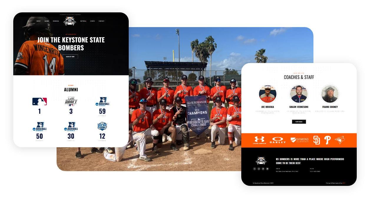
To make sure KS Bombers didn’t fade into the noise of competing baseball teams, we chose a color palette and imagery that while being professional and appropriate for the audience, stood out from the look and feel of their competition. We created a sporty, yet professional and eye-catching theme. User-friendly tools helped us create blogs, events, and lineup sections that the client is easily able to add to whenever they wish.
Design
Design was a significant part of this project. The clients were looking for a total overhaul: new website, fresh branding and updated imagery. We designed the website with its brand colors to be both visually arresting and versatile. This updated look was carried throughout to create a striking and consistent look.


Color Scheme
This shade of orange had been the team color since it's inception. So it was obvious to use it as a striking color to complement the monochromatic theme of the website. Orange is a very vibrant and energetic color. In its muted forms it can be associated with the earth and with autumn. Because of its association with the changing seasons, orange can represent change and movement in general.


Typography
Oswald is a clean, modern, condensed sans serif that is known for its simplicity and legibility. Nunito is a well-balanced, highly-readable sans-serif typeface. Both of these worked well together to create the modern and sporty look required for this website.

